JAC Board Class 10th English Analytical Paragraph Writing
JAC Class 10th English Analytical Paragraph Writing Textbook Questions and Answers
An analytical paragraph is a body paragraph. It presents evidence in order to prove the thesis. In it, specific words, phrases or ideas are found as evidence. There is specific connection between the evidence and the topic sentence. Its main goal is to explain something bit by bit to enhance understanding. Analytical paragraph is written about the analysis of a text, a process or an idea. Map is actually a diagram that displays information visually. It can be created using pen and paper. The rules for creating a map are simple.
- Write the subject in the centre of paper.
- Write meaningful keyword to explain them.
![]()
CHART:
You must have seen graphs, charts, etc., in the newspapers, magazines, books, etc. The main purpose of chart is to show numerical facts in visual form so that they can be understood quickly, easily and clearly.
These are actually visual representation of data collected.
There are various methods through which data can be presented quickly.
1. Bar chart: Bar chart is one of the most popular and commonly used methods of presenting data. It makes the comparative study of data easy. It consists of a group of bars which are equi-distance from each other. Bar charts are read by the measurement of the length or the height of the bars. It is used for the clarity of presentation. The example is as follows:
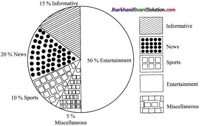
2. Pie chart: Pie chart is used to compare a part of whole. It is used to represent a circular representation of data. Each part is in proportion to its share of the whole data. In circular figure, it is divided into different sectors or segments.
3. Tabular presentation: It is one of the most common forms of data presentation.
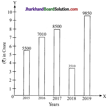
Production of steel and sales in rupees
| Year | (Production) | Sales (in Rupees) |
| 2015 | 1500 tons | 3 crore |
| 2016 | 1650 tons | 4.5 crore |
| 2017 | 1725 tons | 5.10 crore |
| 2018 | 1850 tons | 6.3 crore |
| 2019 | 1990 tons | 6.75 crore |
![]()
4. X-Y charts: X-Y charts are represented on x-y planes. In this type of charts, the data are represented on x-y planes. In it, one axis represents one or more variable while the other axis represents an another variable. The example is as follows:
5. Histogram: Histogram is a bar graph that shows data in intervals. It can be represented in the following manner.
| Weights (kg) | 20-30 | 30-40 | 40-50 | 50-60 | 60-70 |
| No. of persons | 0 | 8 | 10 | 16 | 18 |
Vertical Bar Diagram: In the table given, the birth rate in India has been given according to census survey of different years. Put the information in the form of a vertical simple bar diagram.
| Year | 1950-60 | 1961-70 | 1971-80 | 1981-90 | 1991-2000 |
| Birth Rate | 43 | 33 | 29 | 27 | 25 |
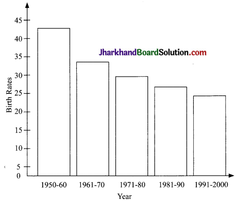
In the bar diagram discussed above, the birth rate in India has been explained in detail. The birth rate in India in 1950-60 was 43 while in 1961-70, decreased up to 33. As the year advanced, the birth rate of India decreased substantially and in 1971-80, it was 29. While in 1981-90, it decreased up to 27 and in 1991-2000, it came to its lowest, i.e., 25.
![]()
Horizontal Bar Diagram:
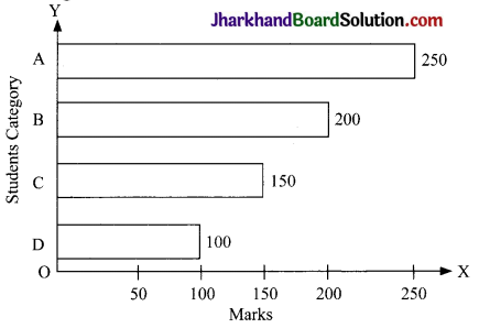
In the given diagram, the category of students and the marks obtained by them have been shown. The students of 19 category obtained 250 marks while the category of B obtained 200 marks. The category of students C obtained 150 marks, while the D category of students obtained 100 marks.
Analytical reports: Analytical reports are one of the most important business intelligence components. It is a type of business report that uses qualitative and quantitative company data to analyse as well as evaluate a business strategy or process. Analytical reporting is based on historical data statistics and can also deliver predictive analysis of a specific issue.
Hints for data interpretation:
- Go through the data carefully. Carefully calculate or interpret things.
- Draw logical conclusion.
- Interpret the data in a logical and systematic way.
- Do not repeat unnecessary details.
- Do not interpret or calculate things which are not mentioned in the data.
- Do not exaggerate.
- Write whatever is depicted or presented in data.
Line Graph
A set of statistical data presented on a graph paper is called a graph. But while presenting the data on a graph paper we get different points. Each point corresponds to a value of statistical series. A line graph has X and Y axis. All line graphs must have a title and a key. All the lines must be connected to the data points. The lines on a line graph can go in upward direction and in downward direction. Line graphs are able to answer the questions pertaining to data. A line graph may also be referred to as a line chart. Line graph can be used to compare different events, situations and information.
There are two axes of a line graph. The x-axis of a graph shows the occurrences and the categories being compared over time and the y-axis represents the scale. All the line graphs must have a title. It provides a general overview of what is being displayed. A line graph represents the event, situation and information being measured in due course of time.
Questions (Solved)
Question 1.
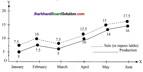
Observe the given graph and analyse the data. Monthly production of an iron factory in(Tons) and sales in (Lakhs) rupees.
Answer:
In the given graph the monthly production and sales of factory are shown. In the month of January, the production of company was 5,000 tons while the sale was 7,50,000 rupees. In February, the production increased more than half and sales also went upto 10,000,00 rupees. But there was a sharp decline in the production and even sales of iron in the month of March. In the month of April, the production and sale of iron increased at a tremendous pace. From April to May the sale and production of the company also increased but from May to June the sale and production increased slightly. So, from the above graph it can be inferred that there was upward and downward trend in both the sale and production of the iron.
![]()
Question 2.
| Years
| Depts. | Number of workers | |||
| Marketing | Production | Official | Accounts | HR | |
| 2014 | 15 | 125 | 5 | 10 | 4 |
| 2015 | 20 | 150 | 10 | 10 | 6 |
| 2016 | 25 | 160 | 15 | 12 | 3 |
| 2017 | 30 | 125 | 8 | 7 | 8 |
| 2018 | 35 | 105 | 12 | 06 | 9 |
| 2019 | 40 | 170 | 5 | 4 | 5 |
| 2020 | 42 | 180 | 08 | 4 | 14 |
Study the table carefully and give detailed description of the given data logically.
Answer:
The figures in the data show that maximum number of workers were engaged in production and the minimum number of employees were engaged in Human Resource (HR) dept. The numbers of workers engaged in offices were the same in 2014 and 2019 respectively. The number of workers in production increased substantially except in 2017 and 2018. The number of workers in marketing increased substantially as the year advanced.
Question 3.
| Years
| Production of different types ol bike (in thousands) | |||
| Kawasaki | Suzuki | Yamaha | ZF-5 | |
| 2008 | 125 | 130 | 131 | 135 |
| 2009 | 140 | 120 | 125 | 120 |
| 2010 | 130 | 115 | 119 | 118 |
| 2011 | 135 | 113 | 120 | 117 |
| 2012 | 145 | 118 | 121 | 112 |
| 2013 | 150 | 121 | 120 | 109 |
Study the table carefully and answer the following questions.
(i) The production of which type of bike decreased substantially?
Answer:
The production of ZF-5 bike decreased substantially.
(ii) Which type of bike witnessed more production?
Answer:
Kawasaki bike witnessed more production.
(iii) How much production of Kawasaki increased between 2012-13?
Answer:
It increased approximately 3%.
(iv) In which year do you find substantial increase in the production of all types of bike?
Answer:
In 2012, we find substantial increase in the production of all types of bike.
Question 4.
Given below is the turnout of voters including male and female of Maharashtra from 1990 to 2020. Interpret the data.
| Election years | Voters (%) | Male (%) | female (%) |
| 1990 | 48.6 | 45.2 | 38.2 |
| 1995 | 50.5 | 42.5 | 60.3 |
| 2000 | 47.5 | 58.2 | 54.2 |
| 2005 | 55.2 | 50.3 | 52.0 |
| 2010 | 55.6 | 52 | 49.1 |
| 2015 | 58.5 | 56.4 | 53.2 |
| 2020 | 60 | 62.3 | 44.2 |
Answer:
The following details have been discussed through tabular presentation. It shows the details of turnout of voters in Maharashtra from 1990 to 2020. In the year 2020, the turnout of voters was 60%. The percentage of male voters was 62.3%. In the year 2020, and female voters was in maximum in 1995. The turnout of male voters increased subsequently from the year 1990 to 2020. In 2000, the turnout of voters was minimum, i.e., 47.5%. The turnout of female voters was least in 1990. So the data mentioned in the table shows that the voters turnout increased in maximum number of years. But in the case of female voters, it fluctuated; sometimes it increased and sometimes it decreased.
![]()
Question 5.
Observe the given figure carefully. It shows one weeks’ sales figures of cars of different companies in percentage. Also, interpret the data in detail.
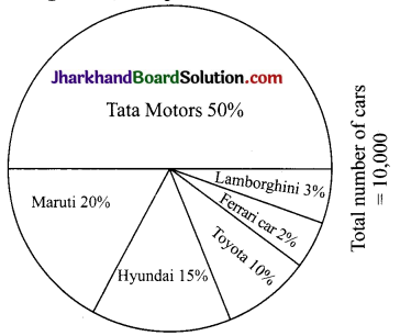
Ans: The above details are of number of cars sold by different auto-companies. The total number of cars sold in a particular week is 10,000. the sales is divided and presented on the pie-chart in terms of swept area according to the percentage sale of a respective car manufacturing company. The exact number of different categories of cars is as follows:
(i) The exact number of the cars of Tata Motors is 5,000.
(ii) The number of cars sold by Maruti is 2,000.
(iii) The number of cars sold by Hyundai is 1,500.
(iv) The number of cars sold by Toyota is 1000.
(v) The number of cars sold used by Ferrari is 200.
(vi) The number of cars sold by Lamborghini is 300.
Question 6.
Study the pie-chart showing the % of pass out students of an engineering college from different states. Study the data and highlight the main trends that emerge out of your study in detail.
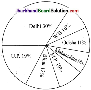
Answer:
The pie-chart dearly exhibits that the pass out percentage of Delhi students is the highest. The minimum pass% of students is from Maharashtra. After Delhi, the maximum percentage of pass out students is from Uttar Pradesh. Later on the percentage of pass out students is from Bihar. The pass out % of West Bengal and Madhya Pradesh is same. So, it can be said that the students of Delhi are more intelligent and hardworking.
Question 7.
Railway carriage charges for different cities.
| Cities | Mumbai | Pune | Bengaluru | Bhubaneshwar |
| Bengaluru | 30 | 35 | 40 | 48 |
| Bhubaneshwar | 35 | 33 | 44 | 47 |
| Mumbai | – | 43 | 53 | 58 |
| Pune | 55 | 53 | 44 | 60 |
Read the given table showing courier charges (₹) for sending 1 kg parcel from one city to the other. Interpret the given details.
Answer:
The above table shows railway carriage charges for sending 1 kg parcel from one city to another. Mumbai, Pune, Bengaluru and Bhubaneshwar are mentioned in the table. The charges for sending parcel from Bengaluru to Mumbai is the least. The highest charges for sending parcel is from Pune to Bhubaneshwar. If the cost per kg is assumed to be directly proportionate to the distance between the cities, then it can be inferred that the distance between Pune and Bhubaneshwar is the most.
![]()
Question 8.
Study the pie-chart and explain it in detail. The ABC Publishers invested crore on all the items.

Answer:
From the above details, it can be inferred that ABC publishers invested a major portion of the amount, i.e., 25 lakh on paper cost. The cost incurred on binding and printing was almost the same, i.e., 20 lakh each on both heads. About 15 lakh was invested on the royalty of authors. The promotion cost and miscellaneous cost was almost the same. It was l0 lakh on each head. So, it can be said tiat the ABC Publishers spent this amount on all the heads concerning to publishing sector.
Question 9.
Study the pie-chart given below and explain it in detail. In the year 2015, Regional Market shares value at 100 crore.
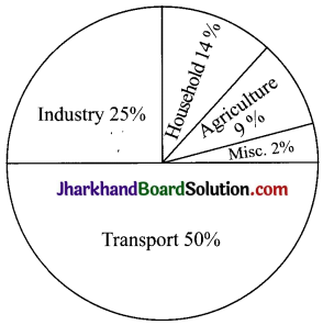
Answer:
In the above pie-chart, the market shares of a region in 2015 have been explained in detail. In the year 2015, on transport sector 50% amount, i.e., ₹50 crore was spent. About 25 crore rupees was spent on industry sector 14% amount i.e., ₹14 crore was spent on household expenditure. In comparison to household sector 9% amount, i.e., ₹9 crore was spent on agriculture. Only 2%, i.e. about 2 crore was spent in miscellaneous expense. So, it can be said that apart from others (Miscellaneous expenses) the market value of agriculture sector was the least.
Question 10.
The chart given below explains the ten causes of deaths in India. It includes the people of all ages due to various diseases. Using the information given in the chart, interpret the data accordingly and rationally. No additional information should be added in the answer.
Ten causes of Death
(People of all age groups)
| Causes of Death | Male (%) | Female (%) | Total (%) |
| 1. Heart Disease | 18.3 | 15.9 | 17.5 |
| 2. Respiration Disease | 10.1 | 8.3 | 9.2 |
| 3. Dairrhoeal Disease | 7.5 | 8.9 | 9.1 |
| 4. Fungal Disease | 5.4 | 3.2 | 4.2 |
| 5. Tuberculosis | 7.2 | 5.3 | 6.4 |
| 6. Malignancy | 3.9 | 3.3 | 3.6 |
| 7. Senility | 5.0 | 6.1 | 5.5 |
| 8. Fractures and Injuries | 4.0 | 2.8 | 3.4 |
| 9. Epidemic Disease | 8.9 | 7.5 | 6.7 |
| 10. Unintentional injuries | 4.3 | 4.4 | 4.3 |
Answer:
The chart mentioned above shows the data regarding the top ten causes of deaths in India. It is quite evident from the data that most deaths occurred due to heart diseases in India. About 17.5% of men and women died due to heart diseases in India. The males (18.3) and female (15.9) died due to heart diseases. As the data shows, due to respiratory diseases the number of deaths in India was 9.2 in total. Again males dominate over the female in respiration disease, i.e., 10.1% and 8.3% respectively. But the sorry state of affairs is that more female, i.e., 8.9% suffered due to diarrheal diseases. This disease was seen less in male rather thin a females population. Due to fractures and injuries less number of people die. Due to epidemic diseases also, the number of deaths among male was 8.9% while among women it was 7.5%. Unintentional injury was also one of the diseases by which the female were more affected than the males. So, these were the factors that led to the death of the males as well as the females.
![]()
Question 11.
The chart given below shows the Index of Markets of various segments of the Indian industries using the information given in the chart, interpret the data in detail and rationally.
| Last year(2019) | This year (2020) | |
| Real Estate | 15,969.01 | 17,731.04 |
| IT Sector | 7,899.02 | 8,333.05 |
| FMCG | 16,764.02 | 19,081.39 |
| Print and Technology | 6,045.03 | 5,039.04 |
| Science & Tech | 8,361.05 | 7,089.05 |
| Petroleum | 18,079.0 | 19,069.5 |
| FCI | 8,237.0 | 7,8,32.5 |
| Education | 5,433.1 | 6,339.01 |
| Private Sector | 9,971.9 | 9,999.2 |
Answer:
The given Index shows a mixed trend. In the Real Estate Sector, there was an upward trend in the year 2020 in comparison to 2019. The main jump was seen in FMCG Sector. But in Print and Technology, there was downward trend. It decreased approximately upto 1000 crore. The mixed trend was shown in the given details. In private sector, there was slight jump in comparison to the last year. In Print Technology, science and technology and FCI, there was downward trend. The upbeat mood was seen only in FMCG sector. So, it can be said that in some sectors, there was a boo but in some sectors there was a drop.
Question 12.
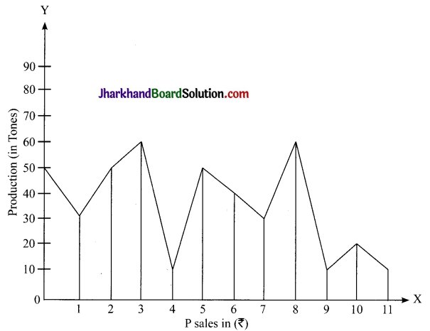
Observe the given line graph and analyse the data.
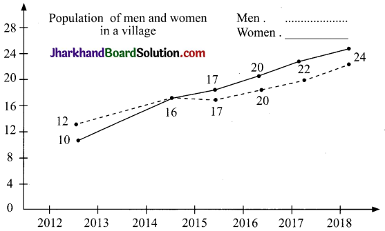
Answer:
The given graph shows the population of men and women in a village through line graph. In the year 2012, the population of men in a village was 12,000 while the population of women – was 10,000. In 2013, the population of men increased approximately half of the population
and women increased about 3%. But the population decreased in 2014 and increased marginally in 2015. But 2015 onward, the population of men increased substantially in all the three years. In 2015, the population of women decreased substantially. But in the year 2016-2017 and 2018 the population of women also increased substantially. The above graph shows the upward and downward trend in both (the number of men as well as women). In years, the population declined while in others the population increased.
![]()
Question 13.
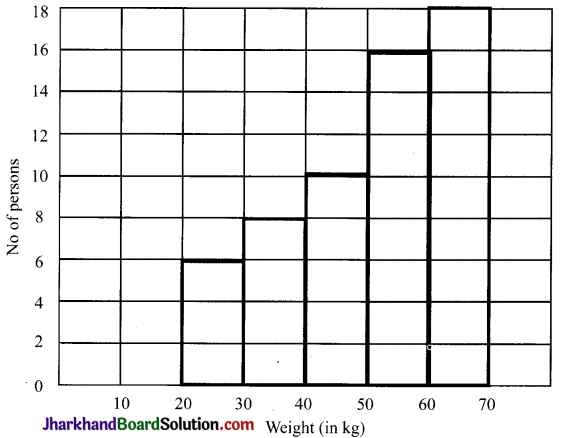
Study the given histogram that shows the number of workers of a village corresponding to different range of weekly wages. Interpret the data and explain the main features.
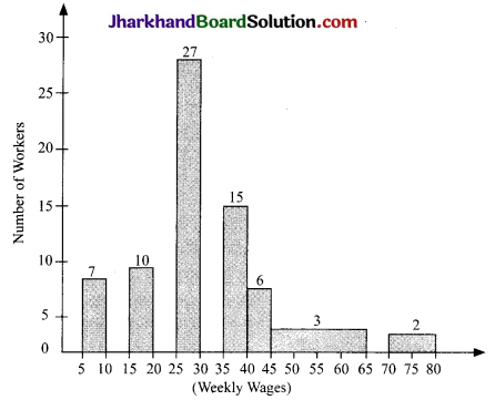
Answer:
The histogram given above shows the number of workers of a village and the distribution of weekly wages. 7 workers were given 5-10 weekly wages while 10 workers were given 15-20 weekly wages, 27 workers were given 35-40 weekly wages. 15 workers were given 35-40 weekly wages. 6 workers were given 40-45 weekly wages. 3 workers were given 45¬65 weekly wages and 2 workers were given 70-80 weekly wages. So, this histogram clearly shows the relation between the number of workers and weekly wages.
There is least difference between the weekly wages of 10-15 and 30-40. The least number of people who were given weekly wages are between 70-80. The maximum number of workers who were given weekly wages were between 25-30.
Question 14.
Study the given histogram that shows distribution of social classes and interpret the data rationally. Also highlight its main features.
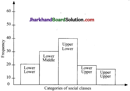
Answer:
The histogram mentioned above shows distribution of social classes. The categories of social classes mentioned in the given histogram are: Lower-lower, Lower-middle, upper- lower, lower upper and upper-upper. The least difference is between lower-lower and lower middle social classes. But the main and wide difference lies between the upper-lower and lower -upper classes. The upper-category has the minimum and the upper-lower class has the maximum frequency. It distribution hightlights the main features of the categories of social classes and its frequency.
![]()
Question 15.
See the given image and write an analytical report on this.
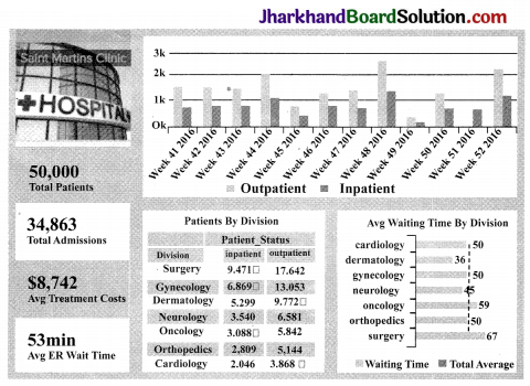
Answer:
The above data lays emphasis on healthcare matrices. It combines statistics and historical data. It goes deeper into the analysis of trends. It can serve as a fundamental part of generating future decisions. These are important to run and modify a hospital strategy. The data in healthcare are becoming expansive and increasing the variety of information it provides. It also uses reports in the form of a dashboards so that eveiy analytical information generated has its own measurement and quality of evidence. The average waiting time clearly increases the effectiveness of different hospital departments. The number of patients can explain why some divisions have the bigger amount of waiting time. It therefore proposes a solution to reduce it. It also reduces costs that directly affect the department. This metric is important for the finance department. The holistic view of all the analysis created and presented in this dashboard cell help management to make better decisions. This classification can also serve as an analytical report. It can then be used as road map to a successful hospital strategy.
Question 16.
See the given figure and write an analytical graph analysis on it.

Answer:
This picture shows the trend analysis of an examination at upper level. In it, questions from different segments have been asked. Most of the questions were asked from current affairs segment. The second major area of thrust was economics. Later on, 15 questions were asked from history, 14 questions were asked from polity and 8 questions were asked from science and technology. It is the area from which less number of questions were asked. So, this picture denotes that questions have been asked from almost all the Stearns. And the students will have to lay equal emphasis on all the subjects.