Students should go through these JAC Class 9 Maths Notes Chapter 14 Statistics will seemingly help to get a clear insight into all the important concepts.
JAC Board Class 9 Maths Notes Chapter 14 Statistics
Introduction:
The branch of science known as Statistics has been used in India from ancient times. Statistics deals with collection of numerical facts ie, data, their classification and tabulation and their interpretation. In statistics we shall try to study, in detail about collection, classification and tabulation of such data.
→ Importance of Data: Expressing facts with the helps of data is of great importance in our day-to-day life. For example, instead of saying that India has a large population it is more appropriate to say that the population of India, based on the census of 2001 is more than one billion.
→ Collection of Data: On the basis of methods of collection, data can be divided into two categories:
(i) Primary data: Data which are collected for the first time by the statistical investigator or with help of his workers is called primary data. For example if an investigator wants to study the condition of the workers working in a factory then for this he collects some data like their monthly income, expenditure, number of brothers, sisters, etc.
(ii) Secondary data: Data already collected by a person or a society and may be available in published or unpublished form is known as secondary data. Secondary should be carefully used. Such data is generally obtained from the following two sources.
- Published sources
- Unpublished sources
![]()
→ Classification of Data: When the data is compiled the same form and order in which it is collected, it is known as Raw Data. It is also called Crude Data. For example, the marks obtained by 20 students of class X in English out of 10 marks are as follow:
7. 4, 9, 5, 8, 9, 6, 7, 9, 2, 0 3, 7, 6, 2, 1, 9, 8, 3, 8
(i) Geographical basis: Here, the data is classified on the basis of place or region. For example, the production of food grains of different states is shown in the following table:
| S. No. | State | Production (in Tons) |
| 1 | Andhra Pradesh | 9690 |
| 2 | Bihar | 8074 |
| 3 | Haryana | 10065 |
| 4 | Punjab | 17065 |
| 5 | Uttar Pradesh | 28095 |
(ii) Chronological classification data’s classification is based on hour, day, week, month or year, then it is called chronological classification. For example, the population of India in different years is shown in following table:
| S.No | Year | Production (in Crores) |
| 1 | 1951 | 46.1 |
| 2 | 1961 | 53.9 |
| 3 | 1971 | 61.8 |
| 4 | 1981 | 68.5 |
| 5 | 1991 | 88.4 |
| 6 | 2001 | 100.01 |
(iii) Qualitative basis: When the data is classified into different groups on the basis of their descriptive qualities and properties such a classification is known as descriptive or qualitative classification. Since the attributes cannot be measured directly they are counted on the basis of presence or absence of qualities. For example intelligence, literacy, unemployment, honesty etc. The following table shows classification on the basis of sex and employment.
| Population (in lacs) | ||
| Gender → Position of Employment ↓ | Male | Female |
| Employed | 16.2 | 13.7 |
| Unemployed | 26.4 | 24.8 |
| Total | 42.6 | 38.5 |
(iv) Quantitative basis: If facts are such that they can be measured physically e.g, marks obtained, height, weight, age, income, expenditure etc, such facts are known as variable values. If such facts are kept into classes then it is called classification according to quantitative or class intervals.
| Marks obtained | 10 – 20 | 20 – 30 | 30 – 40 | 40 – 50 |
| No. of students | 7 | 9 | 15 | 6 |
![]()
Definitions:
→ Variate: The numerical quantity whose value varies is called a variate, generally a variate is represented by x. There are two types of variate.
(i) Discrete variate: Its magnitude is fixed. For example, the number of teachers in different branches of a institute are 30, 35, 40 etc.
(ii) Continuous variate: Its magnitude is not fixed. It is expressed in groups like 10 – 20, 20 – 30, … etc.
→ Range: The difference between the maximum and the minimum values of the variable x is called range.
→ Class frequency: in each class, the number of times a data is repeated is known as its class frequency.
→ Class limits: The lowest and the highest value of the class are known as lower and upper limits respectively of that class.
→ Classmark: The average of the lower and the upper limits of a class is called the mid value or the class mark of that class. It is generally denoted by x.
If x is the mid value and his the class size, then the class limits are \(\left(x-\frac{h}{2}, x+\frac{h}{2}\right)\).
Example:
The mid values of a distribution are 54, 64, 74, 84 and 94. Find the class size and class limits.
Solution:
The class size is the difference of two consecutive class marks, therefore class size (h) = 64 – 54 = 10.
Here the mid values are given and the class size is 10. So, class limits are:
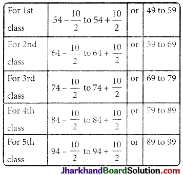
Therefore, class limits are 49 – 59, 59 – 69, 69 – 79, 79 – 89, and 89 – 99.
Frequency Distribution:
The marks scored by 30 students of IX class of a school in the first test of Mathematics out of 50 marks are as follows:
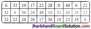
The number of times a mark is repeated is called its frequency. It is denoted by f.
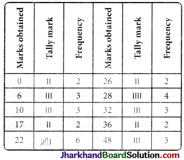
Above type of frequency distribution is called ungrouped frequency distribution. Although this representation of data is shorter than representation of raw data, but from the angle of comparison and analysis it is quite bit. So to reduce the frequency distribution, it can be classified into groups in following ways and it is called grouped frequency distribution.
| Class | Frequency |
| 1 – 10 | 8 |
| 11 – 20 | 2 |
| 21 – 30 | 12 |
| 31 – 40 | 5 |
| 41 – 50 | 3 |
(a) Kinds of Frequency Distribution: Statistical methods like comparison, decision taken etc. depends on frequency distribution. Frequency distribution are of three types.
(i) Individual frequency distribution: Here each item or original price of unit is written separately. In this category, frequency of each variable is one.
Example:
Total marks obtained by 10 students in a class.
| Marks obtained | S. No. |
| 46 | 1 |
| 18 | 2 |
| 79 | 3 |
| 12 | 4 |
| 97 | 5 |
| 80 | 6 |
| 5 | 7 |
| 27 | 8 |
| 67 | 9 |
| 54 | 10 |
(ii) Discrete frequency distribution: When number of terms is large and variable are discrete, i.e., variate can accept some particular values only under finite limits and is repeated then it is called discrete frequency distribution. For example, the wages of employees and their numbers is shown in following table.
| Monthly wages | No. of employees |
| 4000 | 10 |
| 6000 | 8 |
| 8000 | 5 |
| 11000 | 7 |
| 20000 | 2 |
| 25000 | 1 |
The above table shows ungrouped frequency distribution and same facts can be written in grouped frequency as follows:
| Monthly wages | No. of employees |
| 0 – 10,000 | 23 |
| 11,000 – 20,000 | 9 |
| 21,000 – 30,000 | 1 |
Note: If variable is repeated in individual distribution then it can be converted into discrete frequency distribution.
(iii) Continuous frequency distribution:
When number of terms is large and variate is continuous, i.e. variate can accept all values under finite limits and they are repeated then it is called continuous frequency distribution. For example age of students in a school is shown in the following table:
| Age (in years) | Class | No. of students |
| Less than 5 years | 0 – 51 | 72 |
| Between 5 and 10 years | 5 – 10 | 103 |
| Between 10 and 15 years | 10 – 15 | 50 |
| Between 15 and 20 years | 15 – 20 | 25 |
Classes can be made mainly by two methods:
(i) Exclusive series: In this method upper limit of the previous class and lower limit of the next class is same. In this method the value of upper limit in a class is not considered in the same class, it is considered in the next class.
(ii) Inclusive series: In this method value of upper and lower limit are both contained in same class. In this method the upper limit of class and lower limit of next class are not same. Some time the value is not a whole number, it is a fraction or in decimals and lies in between the two intervals then in such situation the class interval can be constructed as follows:
| A | B | ||
| Class | Frequency | Class | Frequency |
| 0 – 9 | 4 | 0 – 9.5 | 4 |
| 10 – 19 | 7 | 9.5 – 19.5 | 7 |
| 20 – 29 | 6 | 19.5 – 29.5 | 6 |
| 30 – 39 | 3 | 29.5 – 39.5 | 3 |
| 40 – 49 | 3 | 39.5 – 49.5 | 3 |
![]()
Cumulative Frequency:
→ Discrete frequency distribution:
From the table of discrete frequency distribution, it can be identified that number of employees whose monthly income is 4000 or how many employees of monthly income 11000 are there. But if we want to know how many employees whose monthly income is upto 11000, then we should add 10, 8, 5 and 7 i.e., number of employees whose monthly income is upto 11000 is 10 + 8 + 5 + 7 = 30. Here we add all previous frequency and get cumulative frequency. It will be more clear from the following table:
| Income | Frequency (f) | Cumulative frequency (cf) | Explanation |
| 4000 | 10 | 10 | 10 = 10 |
| 6000 | 8 | 18 | 10 + 8 |
| 8000 | 5 | 23 | 18 + 5 |
| 11000 | 7 | 30 | 23 + 7 |
| 20000 | 2 | 32 | 30 + 2 |
| 25000 | 1 | 33 | 32 + 1 |
→ Continuous frequency distribution: In (a) part, we obtained cumulative frequency for discrete series. Similarly, cumulative frequency table can be made from continuous frequency distribution also.
For example, for table:
| Monthly income | No. of employees | Cumulative | Explanation |
| Variate (x) | Frequency (F) | Frequency (cf) | |
| 0 – 5 | 72 | 72 | 72 = 72 |
| 5 – 10 | 103 | 175 | 72 + 103 = 175 |
| 10 – 15 | 50 | 225 | 175 + 50 = 225 |
| 15 – 20 | 25 | 250 | 225 + 25 = 250 |
![]()
Graphical Representation Of Data:
(i) Bar graphs
(ii) Histograms
(iii) Frequency polygons
(iv) Frequency curves
(v) Cumulative frequency curves or Ogives
(vi) Pie Diagrams
(i) Bar Graphs. A bar graph is a graph that present categorical data with rectangular bars with heights or lengths proportional to the values that they represent.
Example:
A family with monthly income of ₹ 20,000 had planned the following expenditure per month under various heads: Draw bar graph for the data giyen below:
| Monthly income | No. of employees | Cumulative | Explanation |
| Variate (x) | Frequency (F) | Frequency (cf) | |
| 0 – 5 | 72 | 72 | 72 = 72 |
| 5 – 10 | 103 | 175 | 72 + 103 = 175 |
| 10 – 15 | 50 | 225 | 175 + 50 = 225 |
| 15 – 20 | 25 | 250 | 225 + 25 = 250 |
Solution:
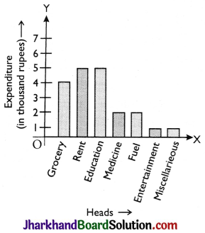
To draw a bar graph, class intervals are marked along x-axis on a suitable scale. Frequencies are marked along y-axis on a suitable scale, such that the areas of drawn rectangles are proportional to corresponding frequencies.
(ii) Histogram: Histogram is rectangular representation of grouped and continuous frequency distribution in which class intervals are taken as base and height of rectangles are proportional to corresponding frequencies.
Now we shall study construction of histo grams related with four different kinds of frequency distributions.
- When frequency distribution is grouped and continuous and class intervals are also equal.
- When frequency distribution is grouped and continuous but class interval are not equal.
- When frequency distribution is grouped but not continuous.
- When frequency distribution is ungrouped and middle points of the distribution are given.
Now we try to make the above facts clear with some examples.
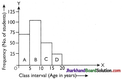
Example:
Draw a histogram of the following frequency distribution.
| Class (Age in year) | 0 – 5 | 5 – 10 | 10 – 15 | 15 – 20 |
| No. of students | 72 | 103 | 50 | 25 |
Solution:
Here frequency distribution is grouped and continuous and class intervals are also equal. So mark the class intervals on the x-axis i.e., age in year (scale 1 cm = 5 year). Mark frequency i.e., number of students (scale 1 cm = 25 students) on the y-axis.
Example:
The weekly wages of workers of a factory are given in the following table. Draw histogram for it.
| Weekly wages | 1000 – 2000 | 2000 – 2500 | 2500 – 3000 | 3000 – 5000 | 5000 – 5500 |
| No. of worker | 26 | 30 | 20 | 16 | 1 |
Solution:
Here frequency distribution is grouped and continuous but class intervals are not same. Under such circumstances the following method is used to find heights of rectangle so that heights are proportional to frequencies the least.
(i) Write the least class size (h), here h = 500.
(ii) Redefine the frequencies of classes by using following formula.
Redefined frequency of class = \(\frac{\mathrm{h}}{\text { class size }}\) × frequency of class interval.
So, here the redefined frequency table is obtained as follows:
| Weekly wages (in Rs.) | No. of workers | Redefined frequency of workers |
| 1000 – 2000 | 26 | 500/1000 × 26 = 13 |
| 2000 – 2500 | 30 | 500/500 × 30 = 30 |
| 2500 – 3000 | 20 | 500/500 × 20 = 20 |
| 3000 – 5000 | 16 | 500/2000 × 16 = 4 |
| 5000 – 5500 | 1 | 500/500 × 1 = 1 |
Now mark class interval on x-axis (scale 1 cm = 500) and no of workers on y-axis (scale 1 cm = 5). On the basis of redefined frequency distribution, construct rectangles A, B, C, D and E.
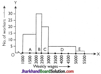
This is the required histogram of the given frequency distribution.
(a) Difference between Bar Graph and Histogram
- In histogram there is no gap in between consecutive rectangles as in bar graph.
- The width of the bar is significant in histogram. In bar graph, width is not important at all.
- In histogram the areas of rectangles are proportional to the frequency, however if the class size of the classes are equal then heights of the rectangle are proportional to the frequencies.
(iii) Frequency polygon: A frequency polygon is also a form of a graphical representation of frequency distribution Frequency polygon can be constructed in two ways:
- With the help of histogram.
- Without the help of histogram.
Following procedure is useful to draw a frequency polygon with the help of histogram.
- Construct the histogram for the given frequency distribution.
- Find the middle point of each upper horizontal line of the rectangle.
- Join these middle points of the successive rectangles by straight lines.
- Join the middle point of the initial rectangle with the middle point of the previous expected class interval on the x-axis.
- Join the middle point of the last rectangle with the middle point of the next expected class interval on the x-axis.
![]()
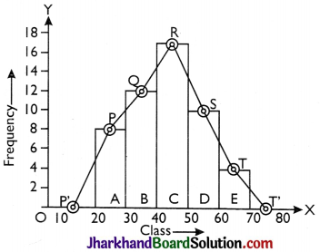
Example:
For the following frequency distribution, draw a histogram and construct a frequency polygon with it.
| Class | 20 – 30 | 30 – 40 | 40 – 50 | 50 – 60 | 60 – 70 |
| Frequency | 8 | 12 | 17 | 9 | 4 |
Solution:
The given frequency distribution is grouped and continuous, so we construct a histogram by the method given earlier Join the middle points P, Q, R, S, T of upper horizontal line of each rectangles A, B, C, D, E by straight lines.
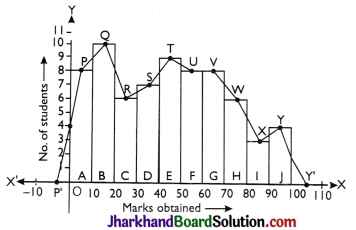
Example:
Draw a frequency polygon of the following frequency distribution table.
| Marks obtained | Frequency (No. of students) |
| 0 – 10 | 8 |
| 10 – 20 | 10 |
| 20 – 30 | 6 |
| 30 – 40 | 7 |
| 40 – 50 | 9 |
| 50 – 60 | 8 |
| 60 – 70 | 8 |
| 70 – 80 | 6 |
| 80 – 90 | 3 |
| 90 – 100 | 4 |
Solution:
Given frequency distribution is grouped and continuous. So we construct a histogram by using earlier method. Join the middle points P, Q, R, S, T, U, V, W, X, Y of upper horizontal lines of each rectangle A, B, C, D, E, F, G, H, I, J by straight line in successions.
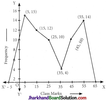
Example:
Draw a frequency polygon of the following frequency distribution.
| Age (in years) | Frequency |
| 0 – 10 | 15 |
| 10 – 20 | 12 |
| 20 – 30 | 10 |
| 30 – 40 | 4 |
| 40 – 50 | 10 |
| 50 – 60 | 4 |
Solution:
Here frequency distribution is grouped and continuous so here we obtain following table on the basis of class.
| Age (in years) | Classmark | Frequency |
| 0 – 10 | 5 | 15 |
| 10 – 20 | 15 | 12 |
| 20 – 30 | 25 | 10 |
| 30 – 40 | 35 | 4 |
| 40 – 50 | 45 | 10 |
| 50 – 60 | 55 | 14 |
Now taking suitable scale on graph mark the points (5, 15), (15, 12), (25, 10) (35, 4), (45, 11), (55, 14).
![]()
Measures Of Central Tendency:
The commonly used measure of central tendency are:
(a) Mean,
(b) Median,
(c) Mode
(a) Mean: The mean of a number of observations is the sum of the values of all the observations divided by the total number of observations. It is denoted by the symbol \(\overline{\mathrm{x}}\), read as x bar.
(i) Properties of mean:
→ If a constant real number ‘a’ is added to each of the observations, then new mean will be \(\overline{\mathrm{x}}\) + a.
→ If a constant real number ‘a’ is subtracted from each of the observations, then new mean will be \(\overline{\mathrm{x}}\) – a.
→ If a constant real number ‘a’ is multiplied with each of the observations, then new mean will be \(\overline{\mathrm{x}}\).
→ If each of the observation is divided by a constant no ‘a’ then new mean will be \(\frac{\overline{\mathrm{x}}}{\mathrm{a}}\).
(ii) Mean of ungrouped data: If x1, x2, x3, ….., xn are n values (or observations) then A.M. (Arithmetic mean) is
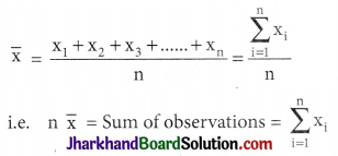
i.e. product of mean and no. of items gives sum of observations.
Example:
Find the mean of the factors of 10.
Solution:
Factors of 10 are 1, 2, 5 and 10.
\(\overline{\mathrm{x}}\) = \(\frac{1+2+5+10}{4}=\frac{18}{4}\) = 4.5
Example:
If the mean of 6, 4, 7, P and 10 is 8, find P.
Solution:
8 = \(\frac{6+4+7+P+10}{5}\)
⇒ P = 13
(iii) Method for Mean of ungrouped frequency distribution:
| xi | fi | fixi |
| x1 | f1 | f1x1 |
| x2 | f2 | f2x2 |
| x3 | f3 | f3x3 |
| · | · | · |
| · | · | · |
| xn | fn | fnxn |
| Σfi | Σfixi |
Then, mean \(\overline{\mathrm{x}}\) = \(\frac{\sum \mathrm{f}_{\mathrm{i}} \mathrm{x}_{\mathrm{i}}}{\sum \mathrm{f}_{\mathrm{i}}}\)
(iv) Method for Mean of grouped frequency distribution:
Example:
Direct Method: For finding mean
| Marks | No. of students (fi) | Mid values (xi) | fixi |
| 10 – 20 | 6 | 15 | 9 |
| 20 – 30 | 8 | 25 | 200 |
| 30 – 40 | 13 | 35 | 455 |
| 40 – 50 | 7 | 45 | 315 |
| 50 – 60 | 3 | 55 | 165 |
| 60 – 70 | 2 | 65 | 130 |
| 70 – 80 | 1 | 75 | 75 |
| Σfi = 40 | Σfixi = 1430 |
\(\overline{\mathrm{x}}\) = \(\frac{\sum f_i x_i}{\sum f_i}=\frac{1430}{40}\) = 35.75
(v) Combined Mean:
\(\overline{\mathrm{x}}\) = \(\frac{\mathrm{n}_1 \overline{\mathrm{x}}_1+\mathrm{n}_2 \overline{\mathrm{x}}_2+\ldots \ldots .}{\mathrm{n}_1+\mathrm{n}_2+\ldots \ldots}\)
(vi) Uses of Arithmetic Mean
- It is used for calculating average marks obtained by a student.
- It is extensively used in practical statistics.
- It is used to obtain estimates.
- It is used by businessmen to find out profit per unit article, output per machine, average monthly income and expenditure etc.
(b) Median: Median of a distribution is the value of the variable which divides the distribution into two equal parts.
(i) Median of ungrouped data:
- Arrange the data in ascending or descending order.
Count the no. of observations (Let there be ‘n’ observations)
If n is odd then median = value of \(\left(\frac{\mathrm{n}+1}{2}\right)^{\mathrm{th}}\) observation.
If n is even then median = value of mean of \(\left(\frac{n}{2}\right)^{\text {th }}\) observation and \(\left(\frac{\mathrm{n}}{2}+1\right)^{\mathrm{th}}\) observation.
Example:
Find the median of the following values:
37, 31, 42, 43, 16, 25, 39, 45, 32
Solution:
Arranging the data in ascending order, we have
25, 31, 32, 37, 39, 42, 43, 45, 46
Here the number of observations, n
= 9 (odd)
∴ Median
= Value of \(\left(\frac{9+1}{2}\right)^{\text {th }}\) observation
= Value of 5th observation = 39.
Example:
The median of the observation 11, 12, 14, 18, x + 2, x + 4, 30, 32, 35, 41 arranged in ascending order is 24. Find the value of x.
Solution:
Here, the number of observations, n = 10.
Since n is even, therefore
Median
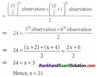
(ii) Uses of Median:
(A) Median is the only average to be used while dealing with qualitative data which cannot be measured quantitatively but can be arranged in ascending or descending order of magnitude.
(B) It is used for determining the typical value in problems concerning wages, distribution of wealth etc.
(c) Mode:
(i) Mode of ungrouped data (By inspection only): Arrange the data in an array and then count the frequencies of each variate. The variate having maximum frequency is the mode.
Example: Find the mode of the following array of an individual series of scores 7, 10, 12, 12, 12, 11, 13, 13, 17.
| Number | 7 | 10 | 11 | 12 | 13 | 17 |
| Frequency | 1 | 1 | 1 | 3 | 2 | 1 |
∴ Mode is 12
(ii) Uses of Mode: Mode is the average to be used to find the ideal size, e.g., in business forecasting, in manufacture of ready-made garments, shoes etc.
Empirical Relation Between Mode, Median And Mean:
Mode = 3 Median – 2 Mean
Range:
The range is the difference between the highest and lowest scores of a distribution. It is the simplest measure of dispersion. It gives a rough idea of dispersion. This measure is useful for ungrouped data.
(a) Coefficient of the Range:
If R and h are the lowest and highest scores in a distribution then the coefficient of the Range = \(\frac{\mathrm{h}-\mathrm{R}}{\mathrm{h}+\mathrm{R}}\)
Example: Find the range of the following distribution: 1, 3, 4, 7, 9, 10, 12, 13, 14, 16 and 19.
Solution:
R = 1, h = 19
∴ Range = h – R = 19 – 1 = 18.